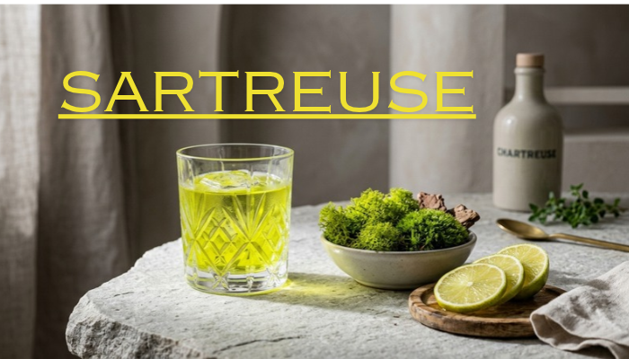
If you searched for sartreuse, you are most likely looking for chartreuse, the established name of a bright yellow-green color. Chartreuse sits between yellow and green, making it one of the most noticeable shades in the color spectrum. It is commonly used in fashion, graphic design, home decor, branding, and digital interfaces.
The word chartreuse has another meaning too. It is also associated with a famous French herbal liqueur, which is where the color name comes from. Understanding both meanings helps explain why the term appears in very different contexts.
This guide explains what sartreuse means, what chartreuse looks like, its color codes, how it compares with similar shades, and how you can use it effectively in design and everyday color combinations.
What Does Sartreuse Mean?
Sartreuse is generally a misspelling or variation of the word “chartreuse.”
Chartreuse is the standard spelling used for the yellow-green color. It can also refer to a traditional French herbal liqueur.
If you searched for terms such as sartreuse color, sartreuse green, or sartreuse meaning, the information you are looking for is most likely related to chartreuse.
The correct spelling is particularly useful when searching for the color in design software, color libraries, fashion resources, or web-development tools.
What Is Chartreuse?
Chartreuse is a bright yellow-green color that combines noticeable qualities of both yellow and green.
The standard digital version is highly saturated and vivid. It has a fresh appearance that can make nearby colors look darker or less intense by comparison.
A simple way to think about chartreuse is as a color positioned between:
Yellow ← Chartreuse → Green
However, chartreuse is not limited to one exact visual appearance. Some shades are more yellow, while others lean more toward green. Designers can also create softer, darker, or less saturated versions.
What Does Chartreuse Look Like?
Chartreuse is usually easy to recognize because of its intense yellow-green appearance.
Depending on the particular shade, it can look:
- Bright and energetic
- Yellowish green
- Greenish yellow
- Lime-like
- Fresh and spring-inspired
- Neon-like
- Soft and muted
- Dark and earthy
The standard digital chartreuse is particularly bright. Because of this, it often works better as an accent than as the dominant color in a design.
For example, a chartreuse button on a dark background can immediately attract attention. A large chartreuse background, however, can feel much more intense.
What Is the Chartreuse Color Code?
For digital design, the standard CSS chartreuse color is:
| Color System | Chartreuse Value |
|---|---|
| HEX | #7FFF00 |
| RGB | 127, 255, 0 |
| HSL | 90°, 100%, 50% |
These values describe the standard digital version of chartreuse.
It is important to understand that the word “chartreuse” can describe a broader family of shades in fashion, paint, printing, and interior design. Therefore, two products labeled chartreuse may not look exactly the same.
If you need an exact match for a website or graphic, use the specific HEX, RGB, or other color value rather than relying only on the color name.
Is Chartreuse Green or Yellow?
Chartreuse is both yellow and green in appearance.
It sits in the yellow-green area, so asking whether it is strictly yellow or strictly green does not give the full picture.
A yellow-leaning chartreuse will look warmer and brighter. A green-leaning version will look closer to lime or spring green.
This flexibility is one reason chartreuse is useful in design. A designer can choose a version that feels warm, energetic, natural, modern, or understated depending on the saturation and brightness.
Chartreuse vs. Lime Green
Chartreuse and lime green are closely related, but they are not necessarily identical.
| Feature | Chartreuse | Lime Green |
|---|---|---|
| Main appearance | Yellow-green | Green with strong yellow influence |
| Brightness | Often very bright | Usually bright |
| Visual effect | Strong and energetic | Fresh and lively |
| Common use | Accents, fashion, design | Nature themes, sports, digital design |
| Exact color | Depends on shade | Depends on color system |
The names are sometimes used loosely in everyday conversation. For accurate digital work, always check the actual color value.
Chartreuse vs. Yellow-Green
Yellow-green is a broader description, while chartreuse refers to a more recognizable named color.
Many colors can reasonably be described as yellow-green without being called chartreuse.
Chartreuse is generally associated with a vivid, high-energy appearance. Yellow-green can include softer, darker, muted, or more natural-looking shades.
This distinction matters when choosing colors for branding, clothing, websites, or interior spaces.
Popular Chartreuse Shades
Chartreuse can be adjusted in several ways to create different visual effects.
Bright Chartreuse
Bright chartreuse is highly saturated and immediately noticeable. It is suitable for accents, highlights, sports designs, posters, and attention-grabbing graphics.
Yellow-Heavy Chartreuse
This variation moves closer to yellow while retaining a green undertone. It can feel warm, energetic, and sunny.
Green-Heavy Chartreuse
A green-heavy version feels more natural and can resemble lime or spring foliage.
Muted Chartreuse
Reducing saturation produces a calmer shade. Muted chartreuse can work well in home decor, clothing, backgrounds, and sophisticated color palettes.
Dark Chartreuse
A darker version can have an earthy appearance. It is easier to combine with other colors when a very bright accent is not appropriate.
What Colors Go With Chartreuse?
Chartreuse is an attention-grabbing color, so pairing it with balanced colors can make a design easier to look at.
Chartreuse and Black
Black provides strong contrast against chartreuse.
This combination can create a bold appearance and works well for:
- Logos
- Posters
- Fashion
- Sports graphics
- Modern websites
Chartreuse and White
White creates a cleaner and lighter combination.
Chartreuse can become the main accent while white provides visual space around it.
Chartreuse and Navy
Navy provides a darker, cooler contrast.
This combination can work particularly well in clothing, branding, websites, and professional graphics.
Chartreuse and Gray
Gray helps soften the intensity of chartreuse.
Light gray can create a clean appearance, while charcoal can produce stronger contrast.
Chartreuse and Deep Green
Dark green creates a natural-looking palette while allowing bright chartreuse to stand out.
This combination can work well for environmental, outdoor, gardening, and nature-related designs.
Chartreuse and Purple
Purple can create a dramatic contrast with chartreuse.
Because the colors are visually different, they should usually be balanced rather than used in equal amounts.
How to Use Chartreuse in Graphic Design
Chartreuse can be extremely effective when used as an accent.
Instead of covering an entire design with the color, consider using it for one or two important elements.
Good uses include:
- Buttons
- Icons
- Highlights
- Borders
- Small illustrations
- Promotional graphics
- Important visual details
For example, a dark website with white text and a chartreuse call-to-action button can create a strong visual hierarchy.
The goal is not to use as much chartreuse as possible. The goal is to give the color enough space to make the elements you want noticed stand out.
Using Chartreuse in Website Design
Chartreuse can work well in web design, particularly when used selectively.
You might use it for:
- Call-to-action buttons
- Links
- Icons
- Navigation highlights
- Badges
- Decorative elements
- Small graphic details
However, extremely bright colors can create readability problems when used for text.
Before publishing a website, test the actual color combination on different screens. A color that looks comfortable on one display may appear much brighter on another.
For important text, accessibility and contrast should always be considered.
Chartreuse in Branding
Chartreuse can give a brand a distinctive visual identity.
It is often useful when a company wants its graphics to appear energetic, youthful, creative, or unconventional.
A brand does not need to use chartreuse everywhere. A small amount can be enough to establish recognition.
For example:
Primary colors: Black + White
Accent color: Chartreuse
This approach allows the bright color to stand out without overwhelming the entire identity.
Chartreuse in Fashion
Chartreuse can be a bold fashion color.
People who want a strong statement can wear it as a main clothing color. Those who prefer something more subtle can use chartreuse as an accessory.
Ideas include:
- Chartreuse jacket with black trousers
- Chartreuse shoes with neutral clothing
- Chartreuse handbag
- Chartreuse scarf
- Chartreuse shirt with navy pants
- Chartreuse accessories with white clothing
For a softer appearance, combine a muted chartreuse shade with beige, cream, gray, or denim.
Chartreuse in Interior Design
Using bright chartreuse across an entire room can create a very intense effect.
Instead, it can be introduced through smaller elements such as:
- Cushions
- Curtains
- Artwork
- Chairs
- Lamps
- Rugs
- Decorative objects
- Small furniture pieces
A muted chartreuse can also work as a larger interior color because it is less visually aggressive.
For example, a neutral room with gray furniture and a few chartreuse accents can feel more energetic without making the entire space bright.
Why Is the Color Called Chartreuse?
The name chartreuse comes from the French herbal liqueur associated with Carthusian monks.
The drink has a long history and became strongly associated with distinctive green and yellow colors.
Over time, the name became used for a color that resembles the characteristic yellow-green appearance associated with chartreuse.
This is why the same word can appear in discussions about both color and beverages.
What Is Green Chartreuse?
Green Chartreuse is a traditional French herbal liqueur.
It is associated with the Carthusian monks and is known for its green appearance and complex botanical character.
The drink is made using a mixture of botanical ingredients. Its strong green color is naturally associated with the ingredients used in its production.
Green Chartreuse and the chartreuse color are related by name, but they are obviously different subjects.
When someone searches for chartreuse, context is important. A designer may be asking about the color, while a food or beverage enthusiast may be referring to the liqueur.
What Is Yellow Chartreuse?
Yellow Chartreuse is another version of the traditional herbal liqueur.
Compared with Green Chartreuse, it has a yellow appearance and is generally associated with a softer and sweeter profile.
The two beverages are distinct products, even though they share the Chartreuse name.
This is another reason the term can appear confusing when searching online.
Common Uses of Chartreuse
Chartreuse has a wide range of practical applications.
Fashion
It can be used for statement clothing, shoes, bags, accessories, and seasonal collections.
Interior Design
It works well as an accent in otherwise neutral rooms.
Graphic Design
Its brightness makes it useful for highlights, posters, illustrations, and promotional materials.
Branding
A company can use chartreuse as an accent color to create a distinctive visual identity.
Web Design
Chartreuse can draw attention to buttons, icons, and other interface elements.
Art
Artists can use chartreuse to create bright highlights, unusual landscapes, energetic compositions, and strong color contrasts.
When Should You Avoid Using Too Much Chartreuse?
Chartreuse is powerful because it is bright.
That same quality can become a disadvantage when it covers too much of a design.
Using large amounts of highly saturated chartreuse may:
- Overwhelm the viewer
- Make text difficult to read
- Reduce visual balance
- Compete with other important elements
- Make a design feel overly intense
A useful approach is to combine chartreuse with neutral or darker colors.
Think of it as an accent rather than automatically treating it as the main color.
How to Choose the Right Chartreuse Shade
The best chartreuse shade depends on the project.
Consider these factors:
Purpose
An advertising graphic may benefit from a vivid shade, while an interior may require something softer.
Background
Bright chartreuse can look very different against white, black, navy, gray, or dark green.
Audience
A youthful brand may use a bright version, while a more traditional brand may prefer a muted variation.
Medium
Colors can appear differently on screens, printed materials, fabrics, and painted surfaces.
Contrast
Always check how easily text and important elements can be seen against the chosen chartreuse shade.
Common Mistakes When Using Chartreuse
Mistake 1: Treating Every Yellow-Green as Chartreuse
Yellow-green is a broad category. Not every yellow-green shade has the same appearance as standard chartreuse.
Mistake 2: Using Too Much Saturation
A highly saturated chartreuse can dominate an entire design.
Mistake 3: Ignoring Contrast
Bright colors are not automatically readable colors. Text and interface elements still need sufficient contrast.
Mistake 4: Relying Only on the Color Name
If exact color matching matters, use a HEX, RGB, CMYK, or other defined value.
Mistake 5: Mixing Color and Liqueur Meanings
Chartreuse can mean a color or a beverage. Always make the context clear.
Frequently Asked Questions About Sartreuse and Chartreuse
Is sartreuse a real color?
“Sartreuse” is generally a misspelling or variant of chartreuse, the established name of a yellow-green color.
What is the correct spelling: sartreuse or chartreuse?
The standard spelling is chartreuse.
What color is chartreuse?
Chartreuse is a bright yellow-green color located between yellow and green.
What is the HEX code for chartreuse?
The standard CSS chartreuse color uses the HEX value #7FFF00.
Is chartreuse the same as lime green?
No. They are closely related colors, but they can have different hues and levels of brightness and saturation.
Is chartreuse more yellow or green?
Chartreuse contains characteristics of both. Some versions lean toward yellow, while others lean toward green.
What colors pair well with chartreuse?
Black, white, navy, gray, deep green, cream, beige, and purple can all work with chartreuse depending on the desired effect.
Is chartreuse a good website color?
It can be very effective as an accent color. Because it is bright, it should be tested carefully for readability and contrast.
What is Green Chartreuse?
Green Chartreuse is a traditional French herbal liqueur associated with Carthusian monks. It is separate from the color, although the two share the same name.
What is Yellow Chartreuse?
Yellow Chartreuse is another variety of the traditional Chartreuse herbal liqueur and has a yellow appearance.
Final Takeaway
If you searched for sartreuse, the term you are most likely looking for is chartreuse. Chartreuse is a distinctive yellow-green color known for its brightness and strong visual presence.
The standard digital chartreuse color is #7FFF00, although many real-world shades can be described as chartreuse. It can be used effectively in fashion, branding, websites, interiors, and graphic design, particularly when balanced with neutral or darker colors.
The word also has a connection to the French Chartreuse liqueur, which explains the unusual name. Whether you are researching a color, choosing a design palette, or trying to understand the term itself, knowing the difference between these meanings makes chartreuse much easier to understand.
See also: fentomagazines.com